Perficient / Equipment Rentals
UX/UI Assessment to recommend improvements for construction equipment rentals
Background
Our team was tasked with evaluating and providing recommendations to encourage long term and new customers of our client to move customer traffic from phones calls to their website and mobile apps. My goal was to find out why customers were resistant to managing their rentals digitally.
My Role: User Experience Architect
Duration: 14 September 2020 - 30 December 2020
Team: My Team included: Another UX Architect, Visual Designers, a UX Lead, a UX Researcher, a Project Manager, a UX Director, with guest appearances from front and back-end developers.
The Solution
Process
Discovery: Take inventory of the Client’s domains
Evaluation: Perform heuristic evaluations, conduct user interviews and UX expert analysis
Alignment: Distill findings into thematic areas of improvement, align with business priorities
UX Development: Create wireframes and visual designs to address thematic improvement areas
Delivery: Document artifacts, consolidate and process assets for delivery to dev team
Discovery
Key Terms
Company (anonymized): A Construction equipment manufacturer whose equipment is purchased by franchises and then rented out. The Client was the core stakeholder representing the Company during our collaboration.
Franchise: Independently owned businesses that purchased equipment from the Company to rent out to a variety of customers.
Customer: Renters of equipment from franchises. These include nationwide construction companies to the everyday person who needed a backhoe for a weekend project. Customers are matched to a franchise based on the location of their jobsite.
Jobsite: The location where rented equipment will be used. Franchises have established service areas. The location of a jobsite within a territory determines which equipment is available based on the affiliated franchise.
Requests: Customers manage their equipment by submitting requests to the franchise via phone, text, email, or the public site. Requests include:
Rental Requests: Asking the Franchise to rent out a new piece of equipment to the customer (similar in function to a traditional ecommerce purchase)
Extend Rental Requests: Informing the Franchise that the contract on a piece of equipment needs to be extended past the original contract end date
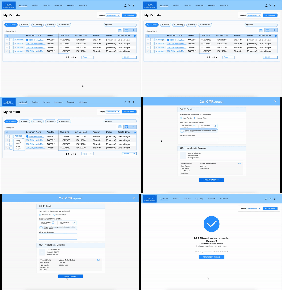
Call Off: Informing the Franchise that the equipment is no longer needed and managing transportation of equipment back to Franchise
Service: Notifying the Franchise that a piece of equipment requires maintenance
Transfer: Informing the Franchise that the equipment needs to move to a different location and managing transportation of equipment to its new location
The Domains
Rental Store (desktop): This included:
Company created catalogue and SEO content
Franchise sub-websites (template): Franchise sub-websites are entirely self-managed, from SEO content, catalogue of equipment, equipment description, main navigation, etc.
Customer “My Account” portion for customers whose accounts were authenticated and connected to one or multiple Franchises.
Companion Mobile Apps: Logged in mobile app experience for customers with equipment already on rent.
Franchise Management Tool: Request management tool connecting the franchises to customer requests.
Evaluation
100 Point Heuristics Analysis (x3)
As a team we divided up the three core domains and conducted a 100 point heuristics evaluation on each. I focused on the Franchise Management Tool.
18 User Interviews
In collaboration with another workstream for the same Client, 18 interviews were conducted with a mixture of customers and employees from 3 different franchises. I conducted 2/3rds of the interviews personally and scribed the remaining third.
76 Use Cases
By combining interview data with personas, we wrote out concise explanations of how these three domains are currently or could be used.
62 Areas of Improvement
Determined by comparing current state to heuristics and best practices, adding in use cases, categories, implementation (future or current) and impacted domains.
Results
Franchises predominantly receive rental requests over the phone, resulting in significant human errors during high call periods. Despite human errors, customers trust a person to fix and address errors more than they are willing to trust a digital system.
The data coming from the franchise’s internal system to the customer’s “My Account” are not live, causing distrust in the accuracy of information.
Inconsistencies in the rental store navigation, design, and typography, lower trust in the legitimacy of the rental store.
Different request types are designed differently causing confusion and distrust.
Customers are comfortable with calling their franchise representatives because of established relationships and a feeling that humans are more accurate than automated systems.
Alignment
Given the number of recommended improvements documented, we decided to focus on designing improvements for the Rental Store, and recommended the client engage Perficient for designated projects for the remaining two.
In order to intentionally address recommendations for the Rental Store, we consolidated our data from the evaluation phase into eight themes. We weighted these by number of use cases and areas of improvement per theme. As a result, four rose to the top as the most critical to address given the tight time frame:
1. Live Data: Users expect real time, useful data about rentals, available equipment, requests, etc.
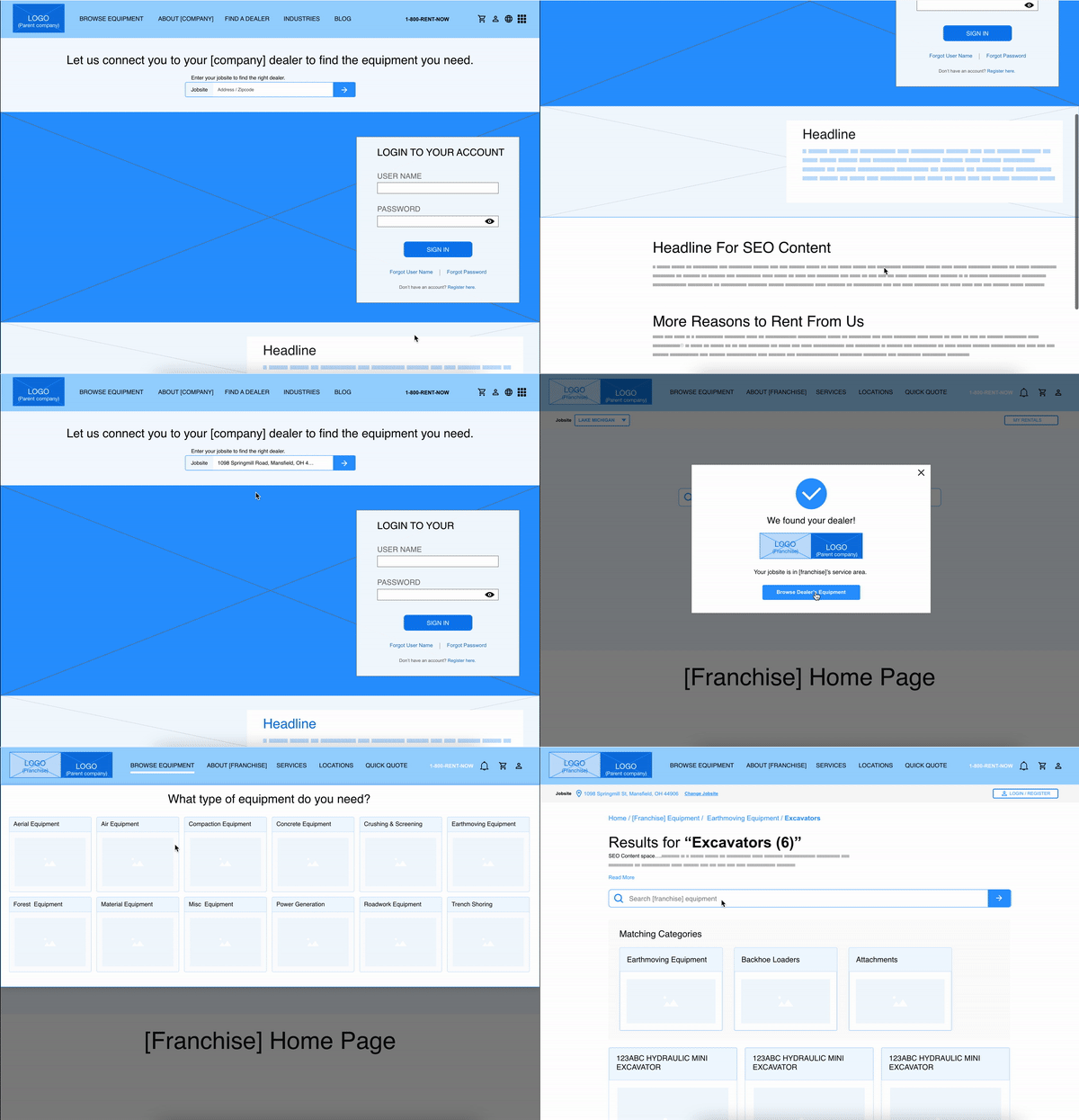
2. Equipment Centric: Content and processes should be structured around getting customers to the correct franchise so they can accurately view equipment available to them.
3. Task Oriented: Experiences should have clear flows with an obvious start and end, cementing user confidence
4. Self Service: Customers expect to be able to start and complete transactions independently
UX Development
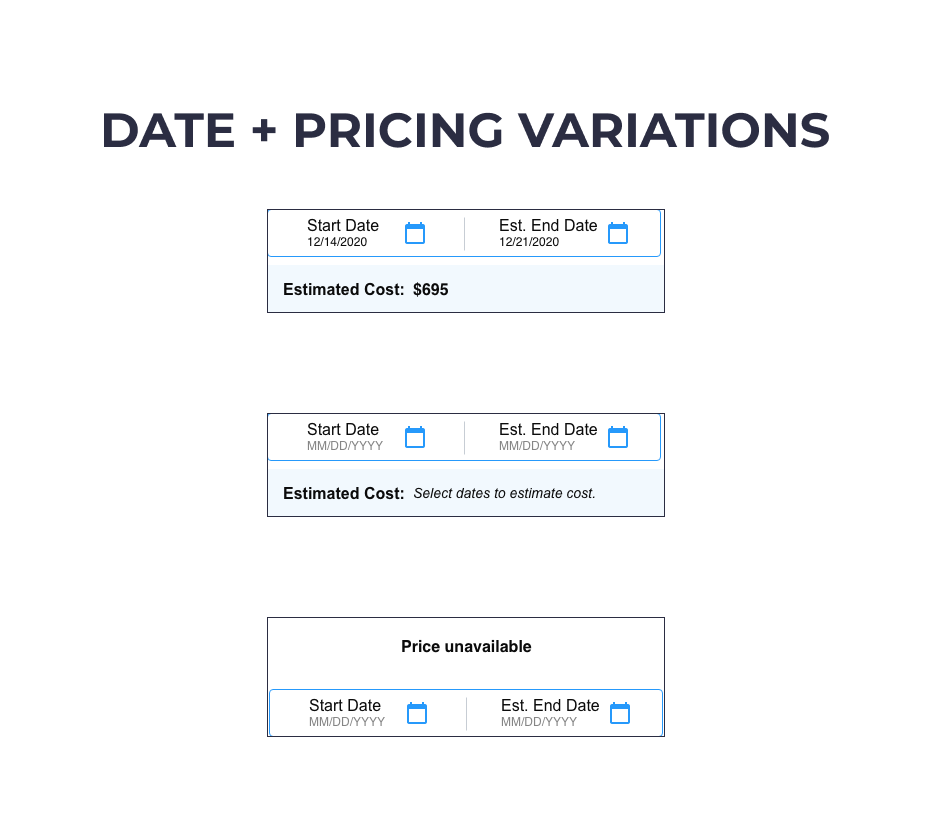
Our goal was to improve customer trust in digital systems by demonstrating consistency, efficiency, and ease of use through a refined digital experience.


Results
Qualitative
The Client LOVED the results and the dev team were thrilled by the level of detail in the wireframes and annotations
Quantitative
As a team, we addressed:
30/35 UX Improvements
43/53 Use Cases
4/4 Improvement Themes
Reflection
During this project, I learned something about myself as a designer: I love structure. I love making a list of to-design recommended improvements, and documenting when they’ve been completed, versioning the design immediately following a design review, and documenting the reasons for incorporating (or not) feedback. To me, it is important to both keep receipts and prevent the design from regressing.
My colleagues were more organic in their approach for this project. They created loose to do lists within our design documents but often deviated. I tested multiple techniques to convince them to mark work we had completed until I found one they liked: drawing a line across the item (this was preferred to just deleting the item, putting a note next to the wireframe, or moving the “to-dos” to a “to-done” list). I also made sure to keep notes for myself documenting design decisions (and reasons) and client feedback.
My extra effort was appreciated in the end, as the running team joke became “if the client questions why we did something, Kim can explain it!” In defense of myself: structured design is organic design, I just happen to be more creative when following a recipe.


